Three hundred years of Russian handwriting, and the four moments that shaped it
Every feature of Russian cursive that confuses a modern reader was introduced deliberately, by someone, for a reason. Here is who, and why.

What Russians call the hand on this page. [^9]
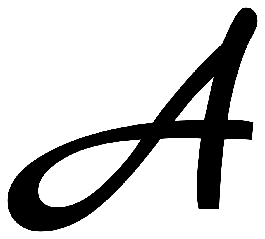
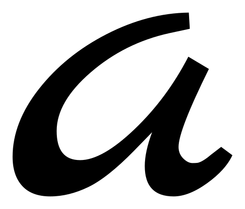
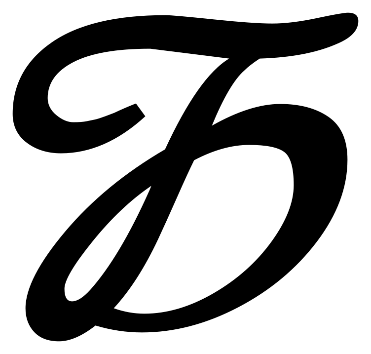
The alphabet, handwritten
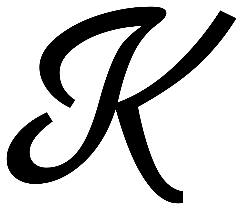
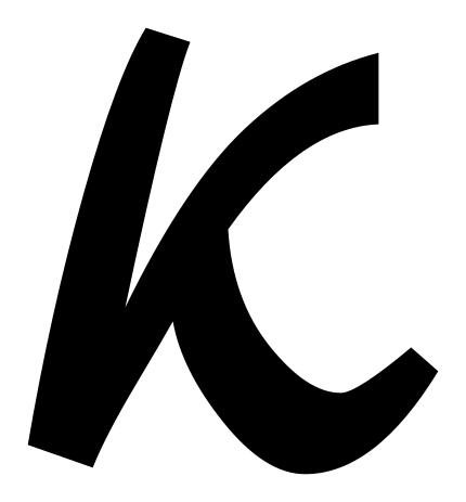
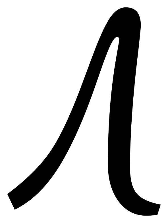
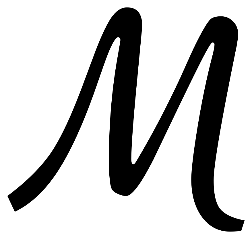
All 33 letters, capital and small. Each one opens its own page.



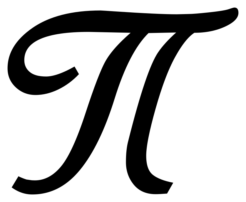
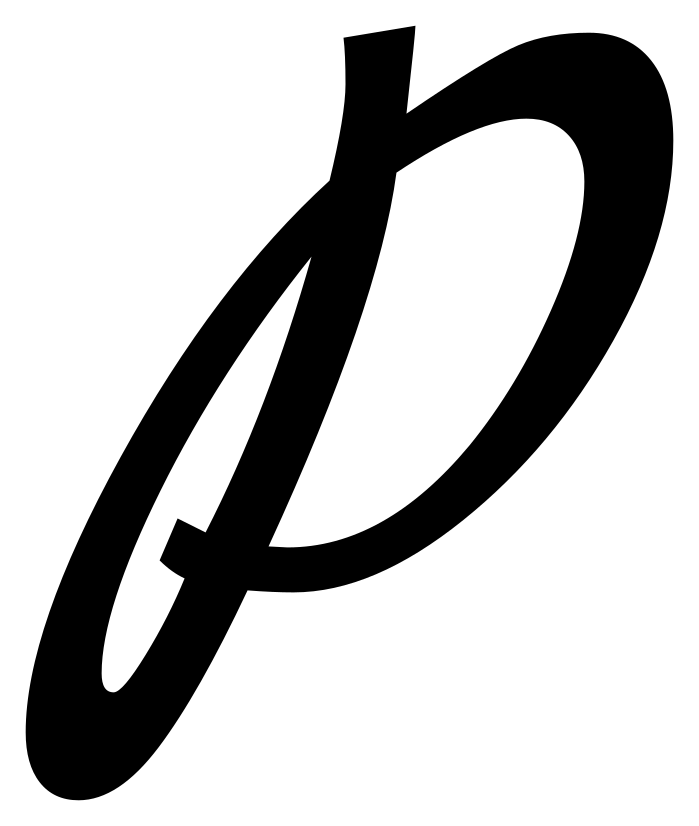
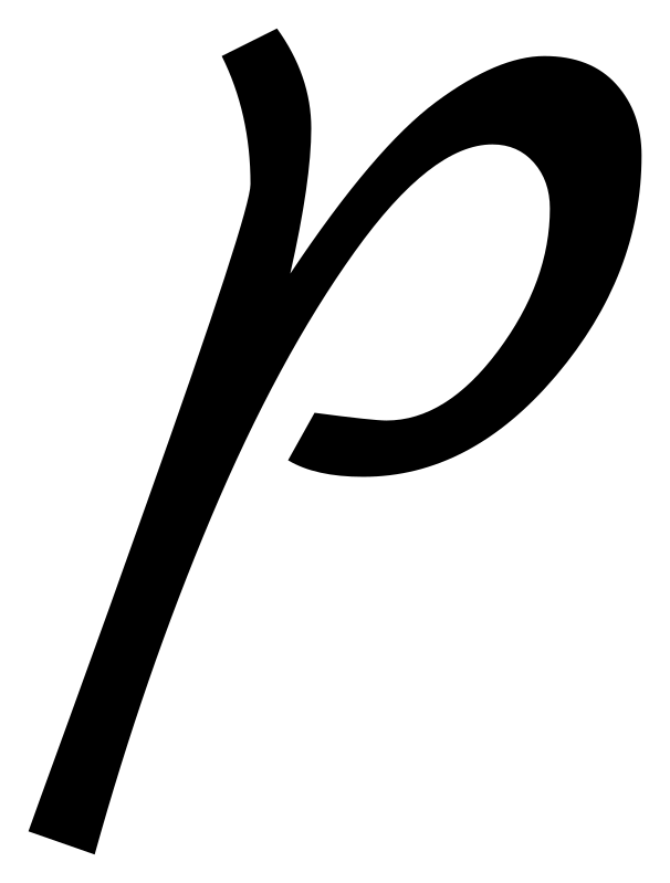
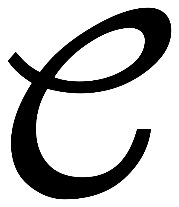
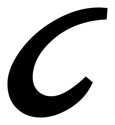
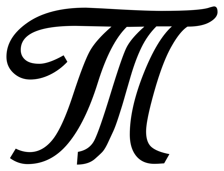
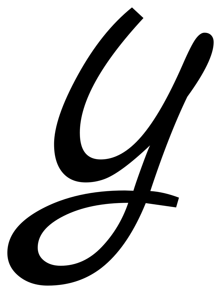
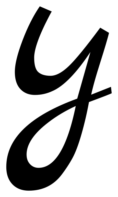
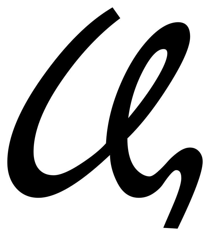
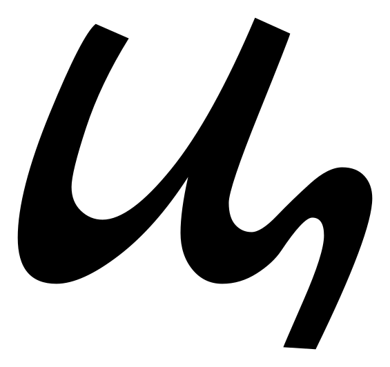
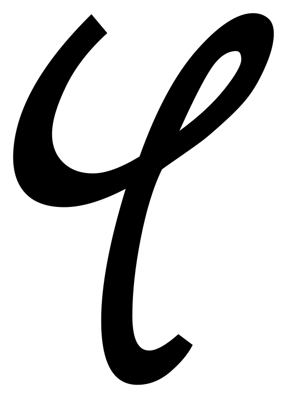
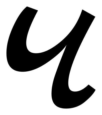

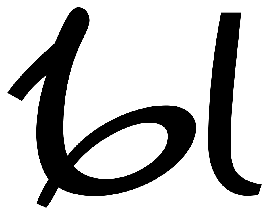
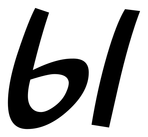
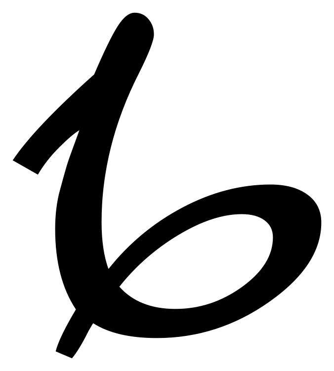
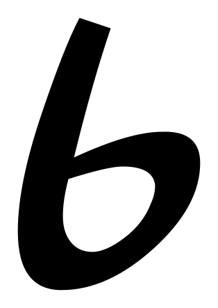
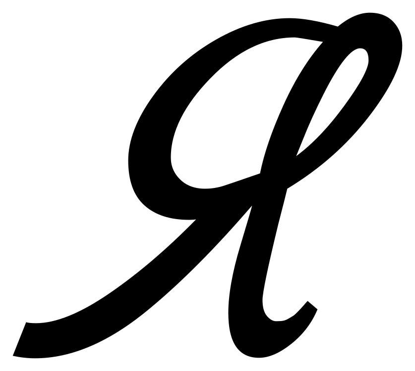
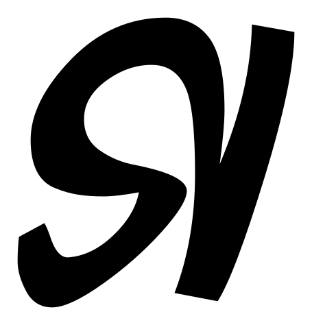
Letters that look nothing like their print
If you read Russian only in print, these are the ones that stop you.
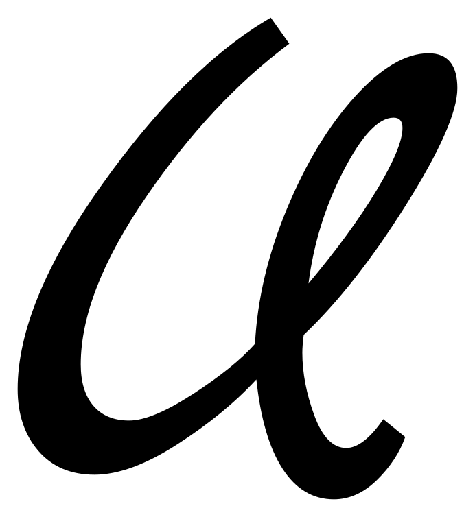
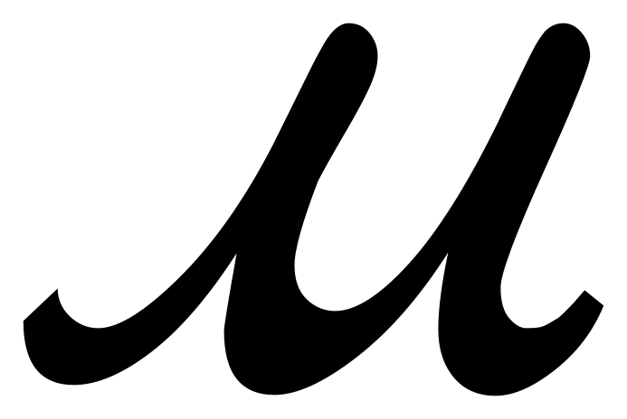
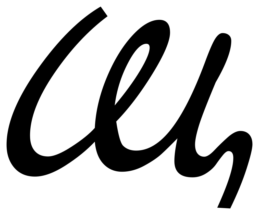
- т
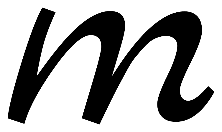
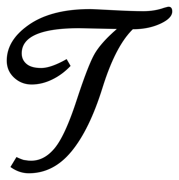
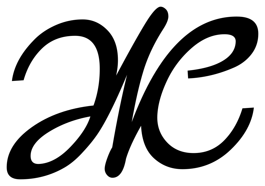
т, te — reads like Latin m
Lowercase cursive т is three down-strokes and reads as a Latin m. Many hands add a bar above it for exactly this reason; if a bar is there, it is т.
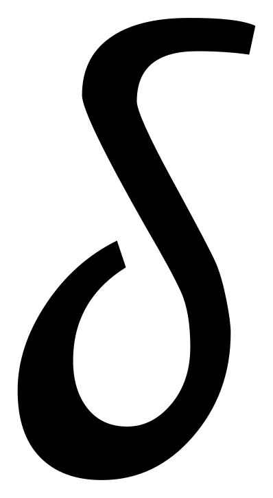
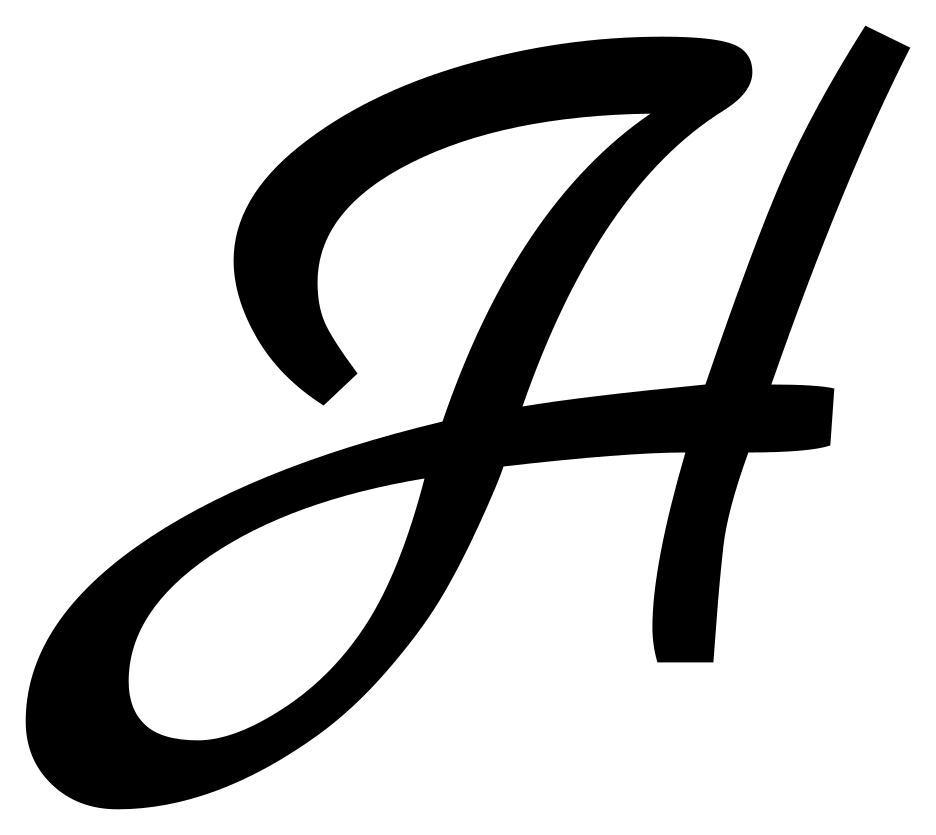
- д
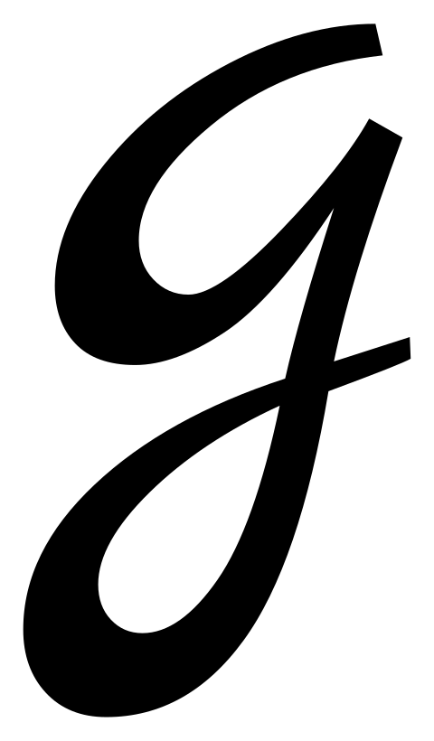
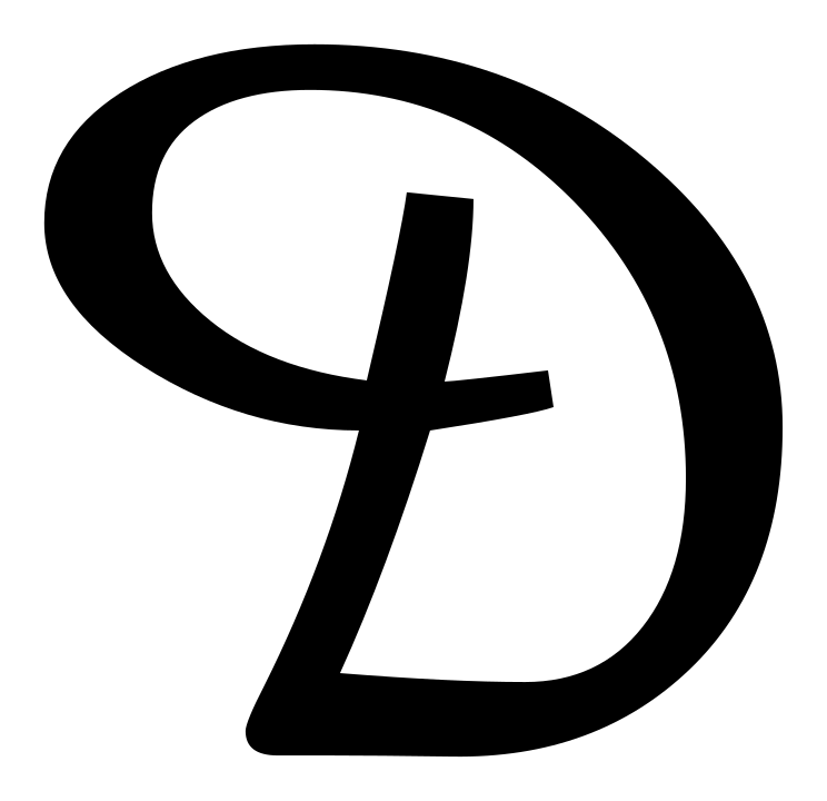
д, de — reads like Latin g
The Cyrillic д closes its descender into a full loop that returns to the baseline and joins the next letter. The Latin g's tail hooks left and stops. If the stroke continues into the following letter, it is д.
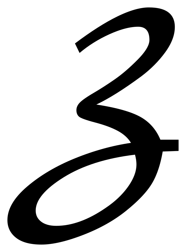
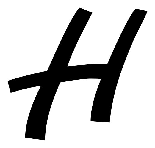
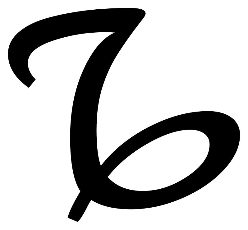
- з
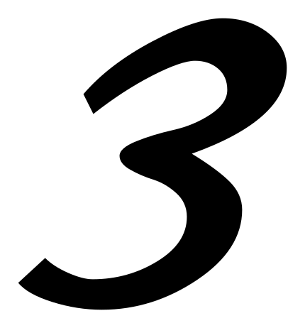
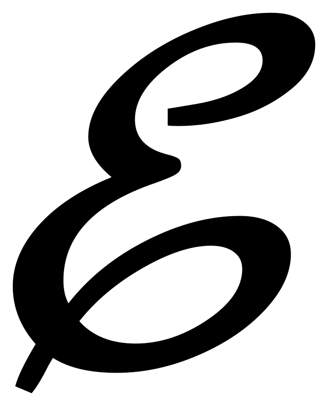
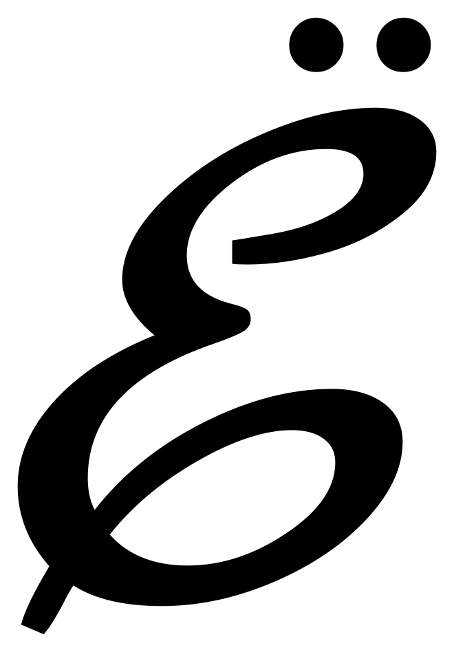
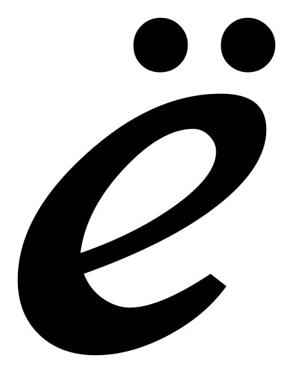
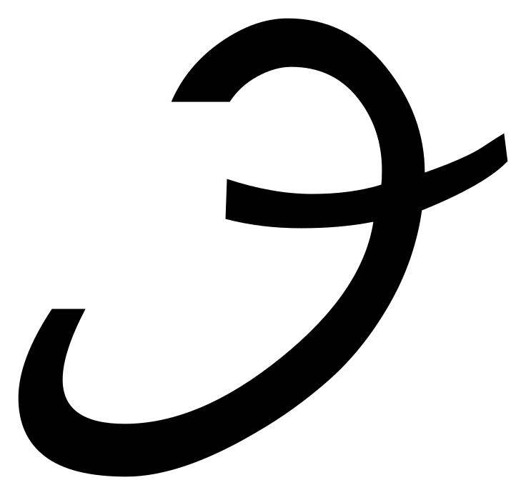
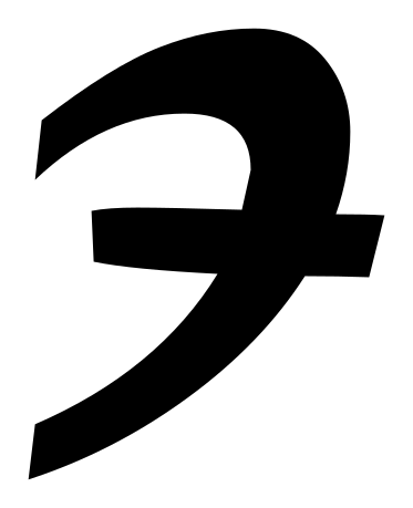
з, ze — reads like Cyrillic E
The Ze article names this pair directly and warns against reading one for the other. The resemblance is a matter of shape: З is the letter that carries /z/, while Э is a separate letter of the alphabet rather than a variant of З. The same article notes that З also runs close in shape to the Arabic numeral three, so where a line mixes words and figures, settle first whether the mark is a letter at all.
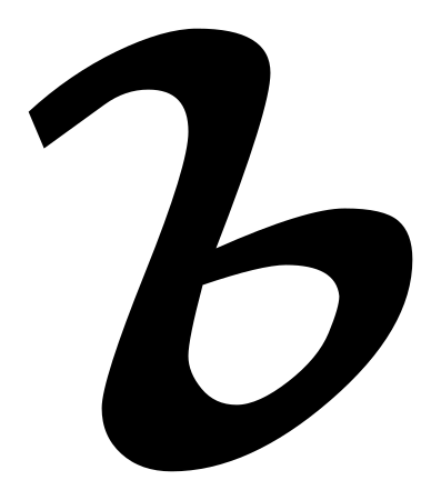
- в
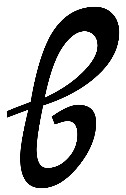
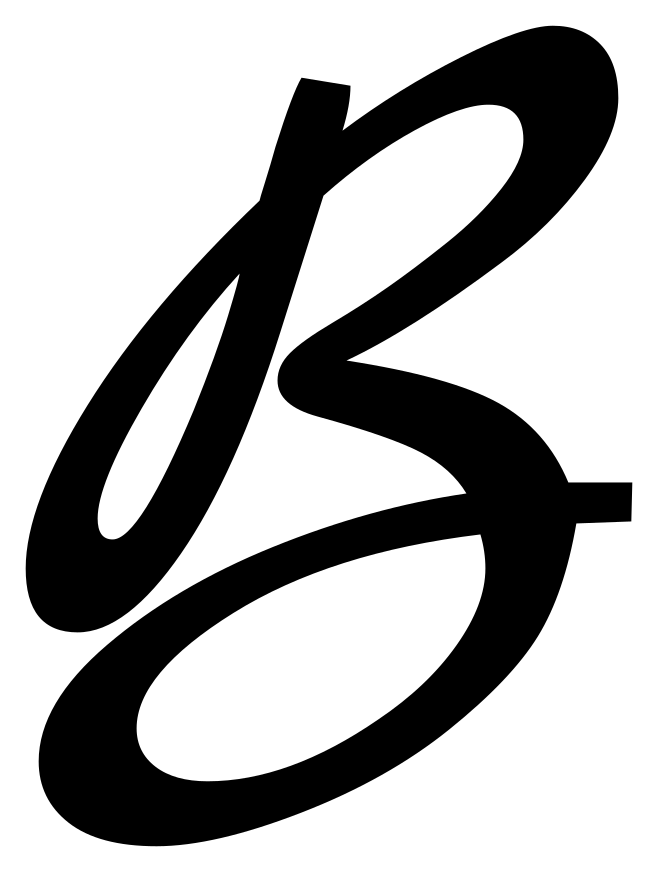
в, ve — reads like Latin capital B
Shape is no guide here. The capital letter Ve looks the same as the capital Latin letter B, but it is pronounced differently: it represents the voiced labiodental fricative /v/, the sound of v in vase, and it is romanized as V under ISO 9. The value to assign is v, whatever the silhouette suggests.
- г
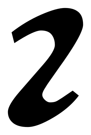
г, ge — reads like Latin r
Cursive г is a single down-stroke with a small shoulder at the top and no ascender. A hand-written Latin r carries a short arm that breaks to the right of the stem.
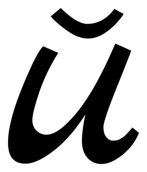
- и

и, i — reads like Latin u
и and a Latin u are the same two-arch shape. Position decides it: и is a vowel between consonants where English would not put one — read the whole word, not the letter.
- п
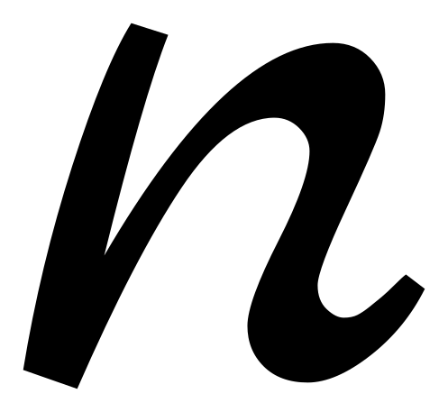
п, pe — reads like Latin n
п is two down-strokes joined by a flat top bar. A cursive Latin n arches OVER the join; п's top is straight.
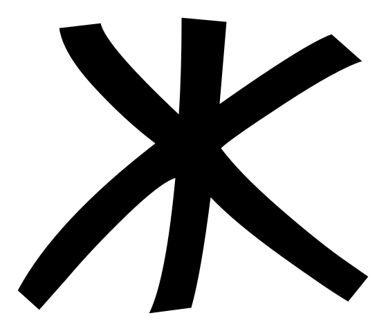
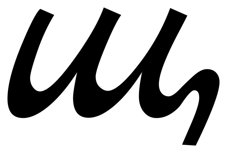
- ш
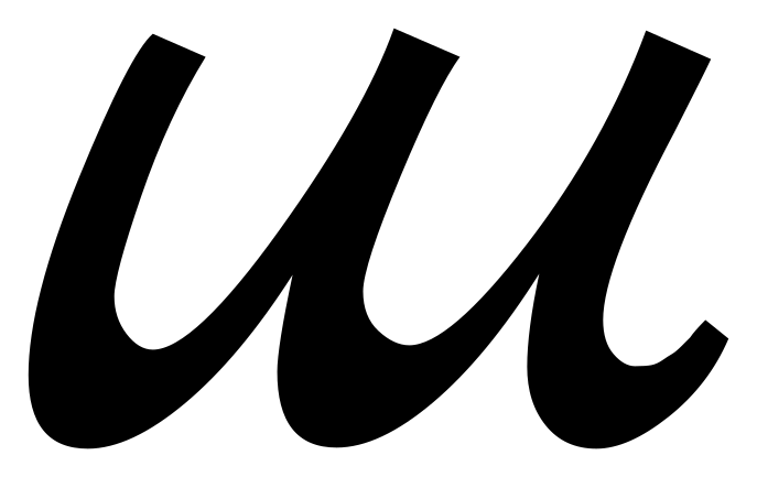
ш, sha — reads like Latin w
ш is three down-strokes sitting flat on the baseline. A cursive Latin w is two V shapes and its joins come to points, not to a flat foot.
Letters joined into words
A greeting from a family letter
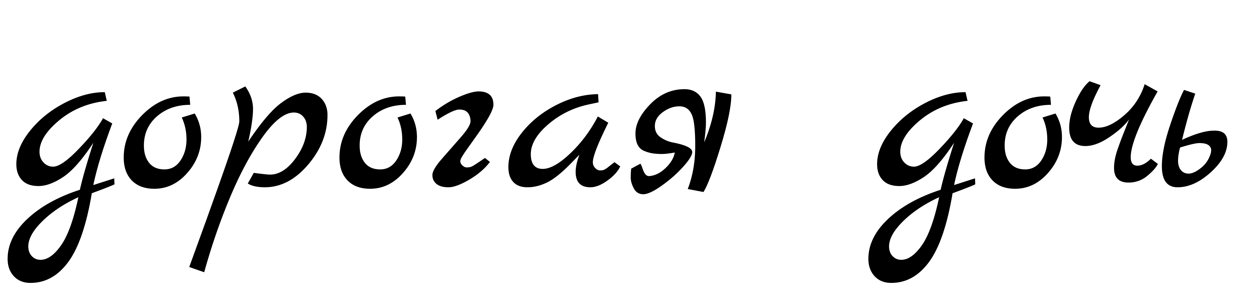
Read it one letter at a time first, then as two words. Every letter in it has its own page below.
Two words, one set of strokes
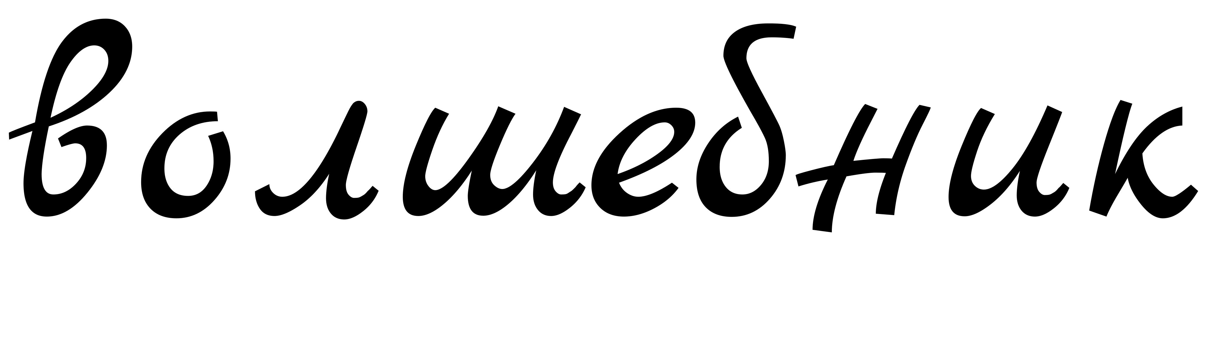
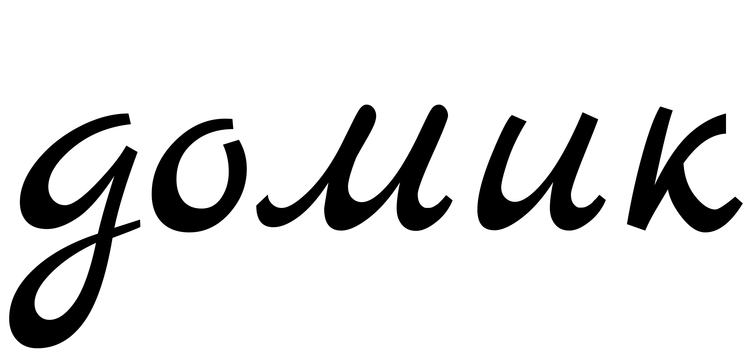
Look for the лш in the first word and the ми in the second. Written, the two pairs come out as the same row of short down-strokes. [^10]
The word everyone gets wrong
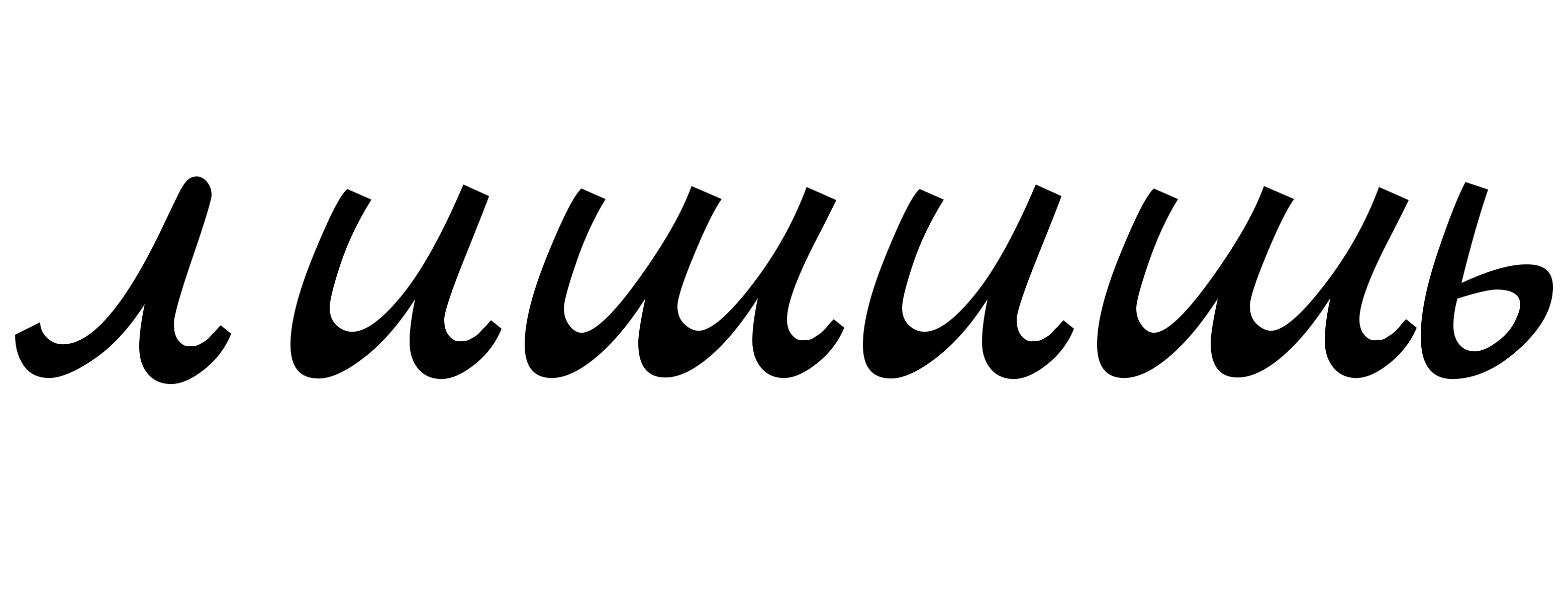
Six letters, and almost every stroke is the same short down-stroke. Count them before you read them. [^11]
Different words, identical on the page
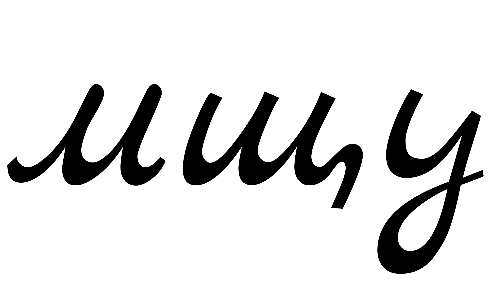
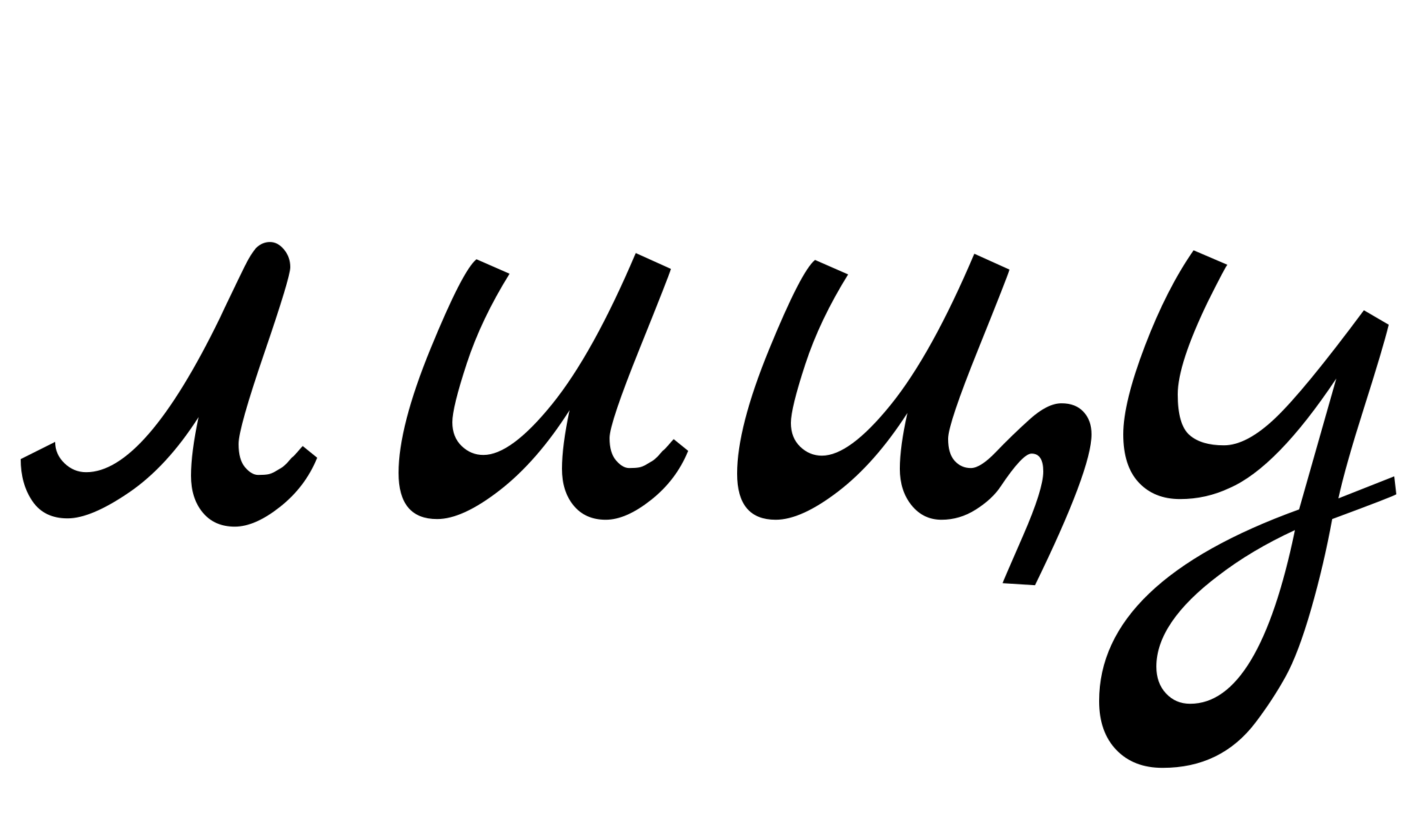
Two unrelated words that cursive makes indistinguishable. Only the sentence around them tells you which one the writer meant. [^12]
Variants you will meet
т and ш can look the same
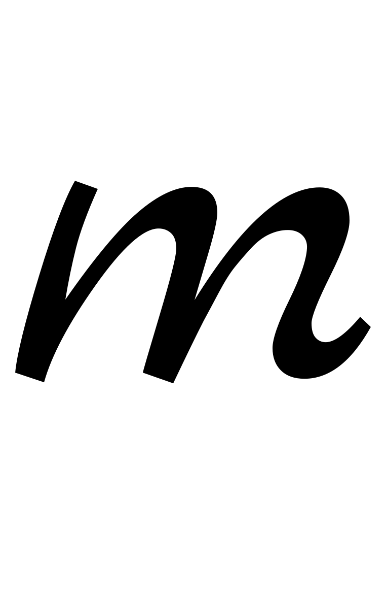
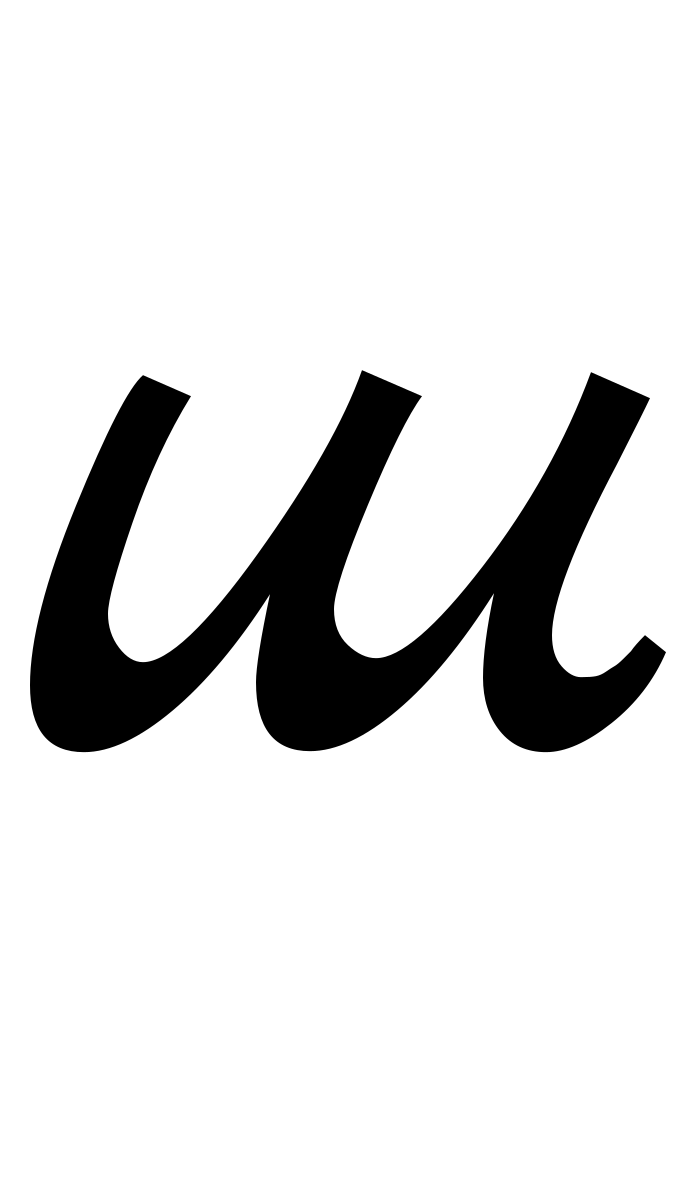
The taught т is three down-strokes, like a Latin m, and ш is three down-strokes too. In some hands the two cannot be told apart. [^13] Writers who noticed drew a bar over т or under ш to settle it; if you see one, that is what it means. [^14]
т written as a T

Many people skip the m-shaped т altogether and write the printed T instead. Both are т. [^15]
The four letters the reform removed
You will meet all four in anything written before 1918, in words like these.
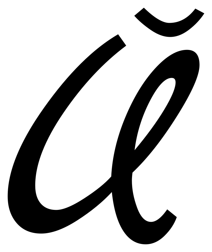
Ѣ ѣ, yat
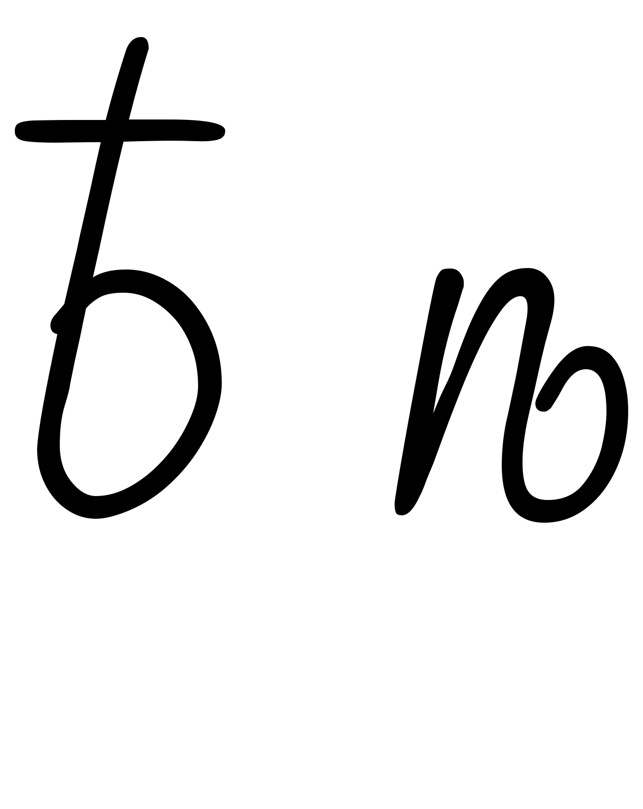
The reform folded ѣ into е. [^5] Until then the spelling kept apart words that sound alike, like ѣсть, to eat, and есть, there is. [^16]
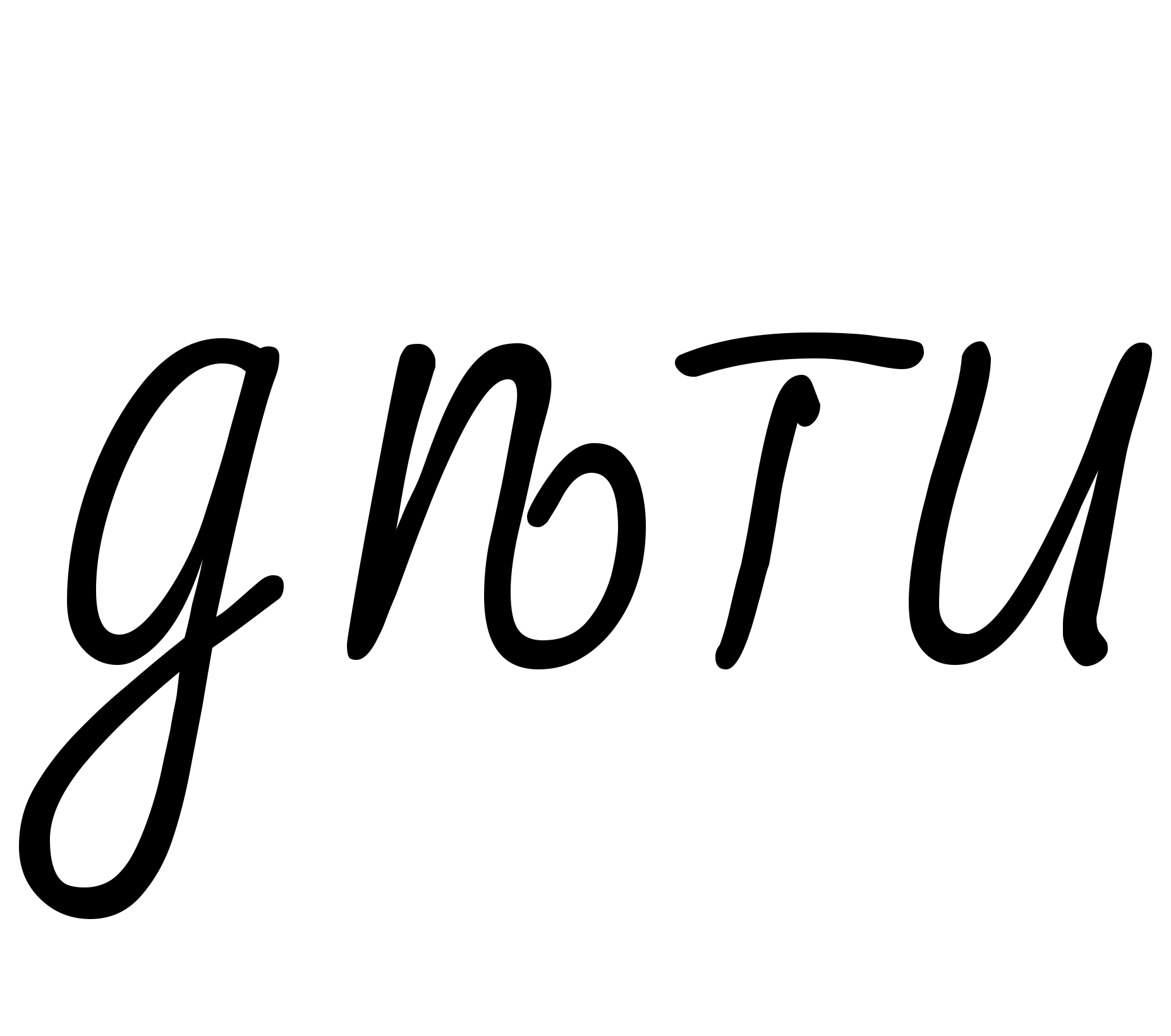

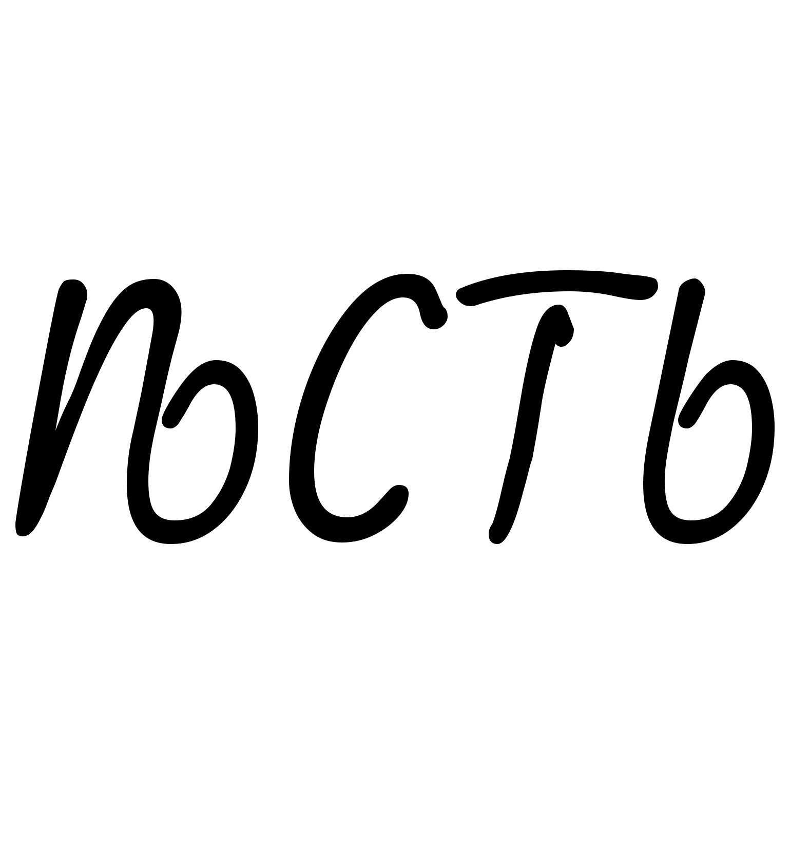
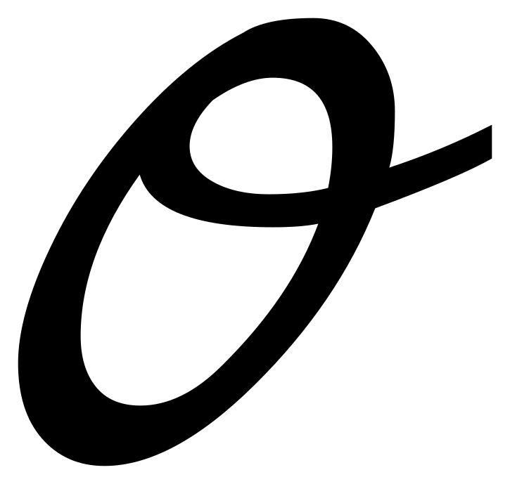
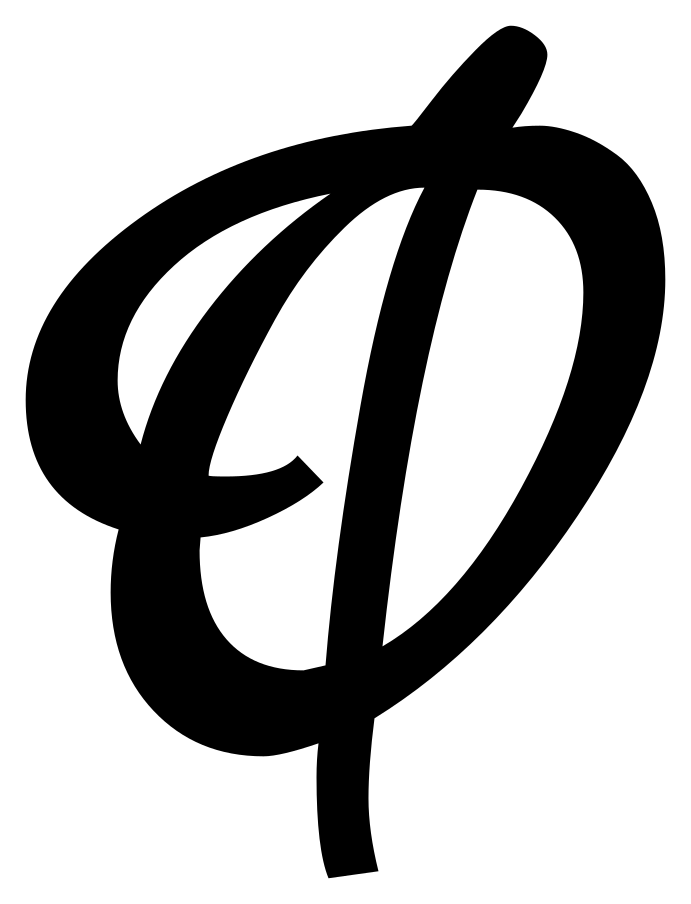
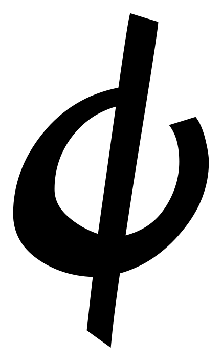
Ѳ ѳ, fita
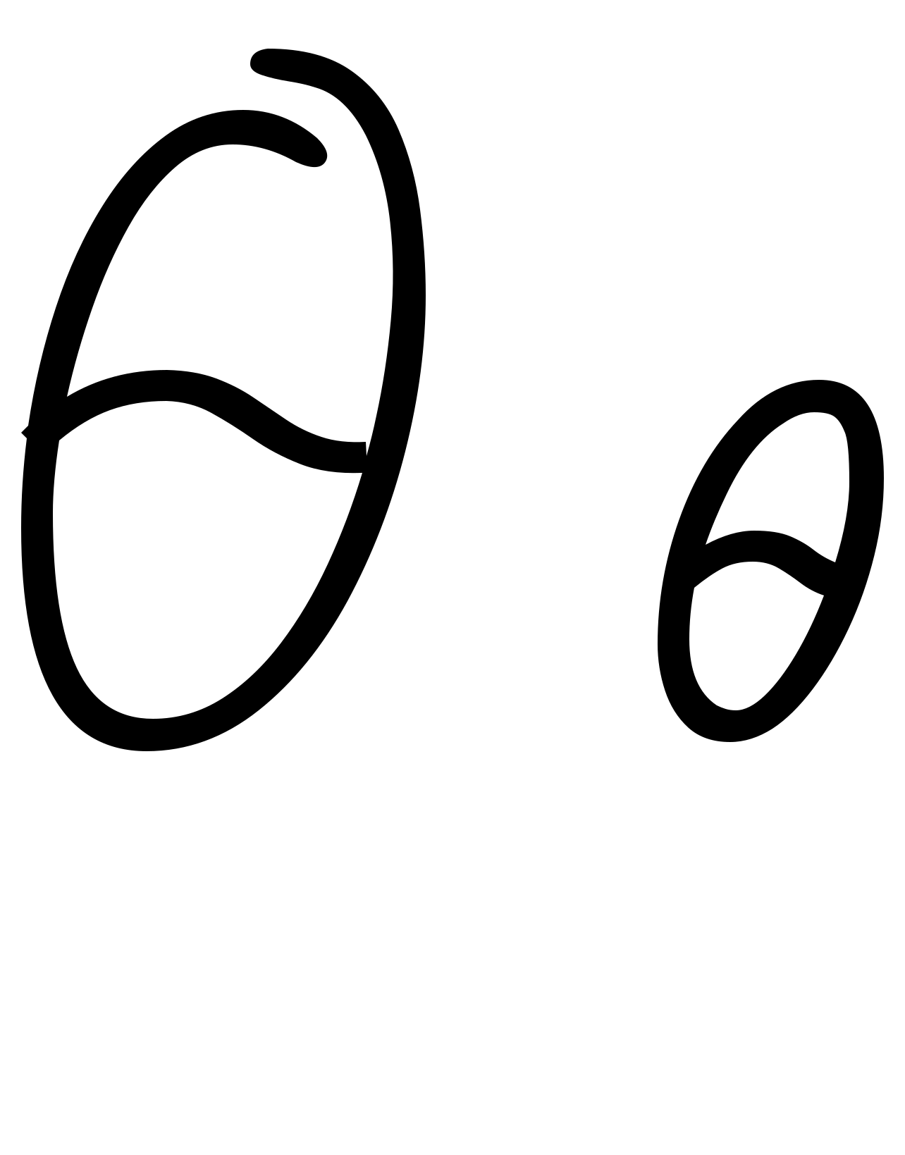
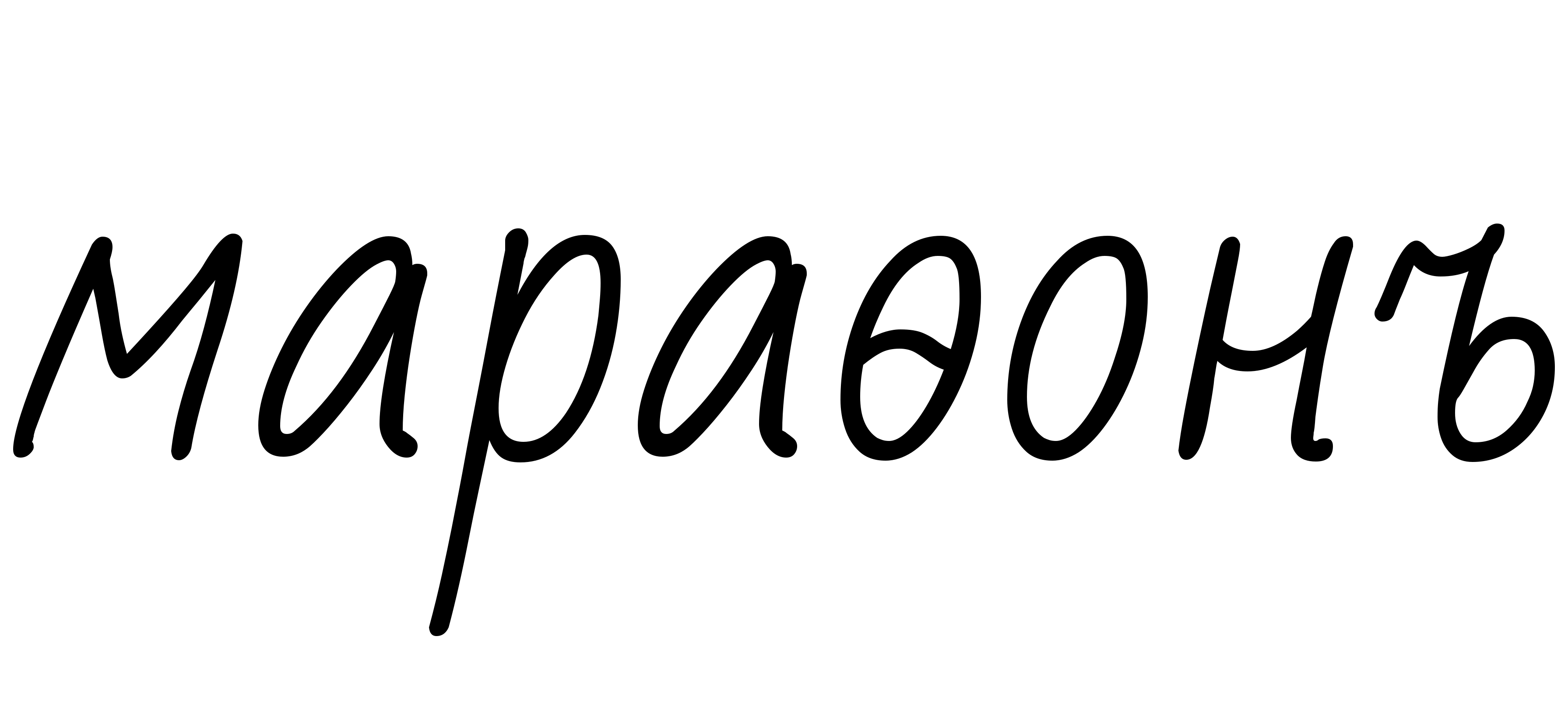
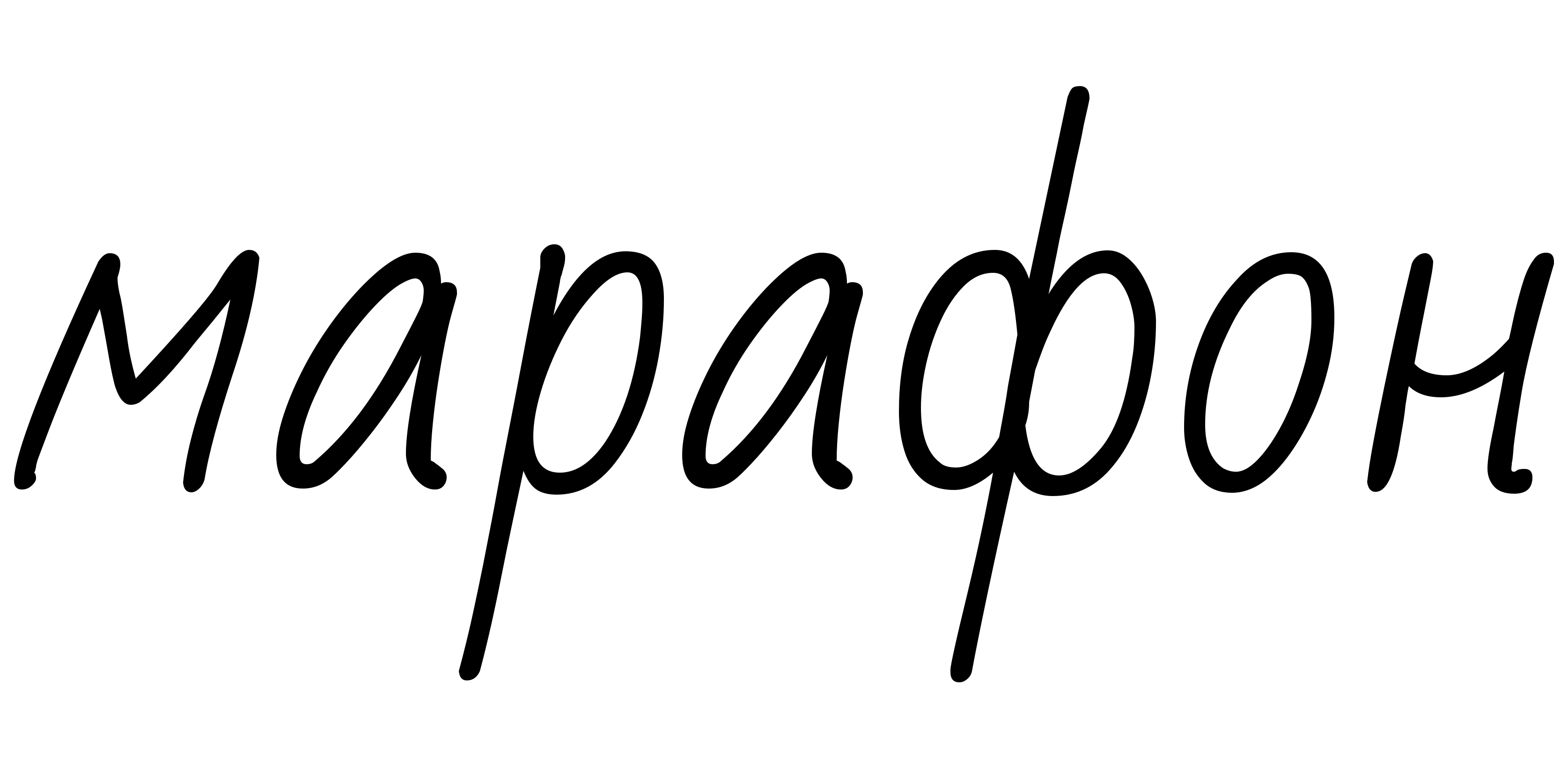
You meet fita in names and borrowed words that came from Greek or through it. [^19] The reform replaced it with ф. [^5]
Ѵ ѵ, izhitsa
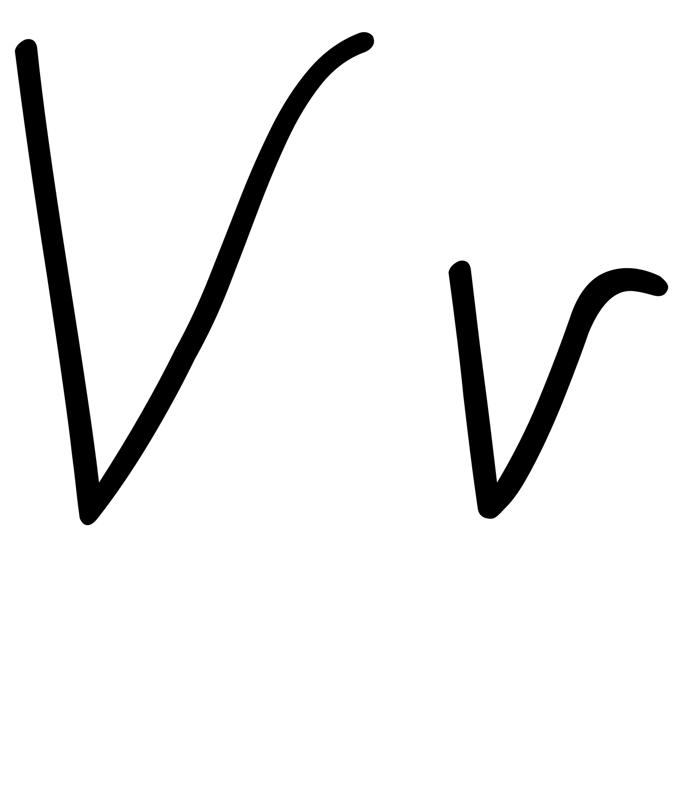
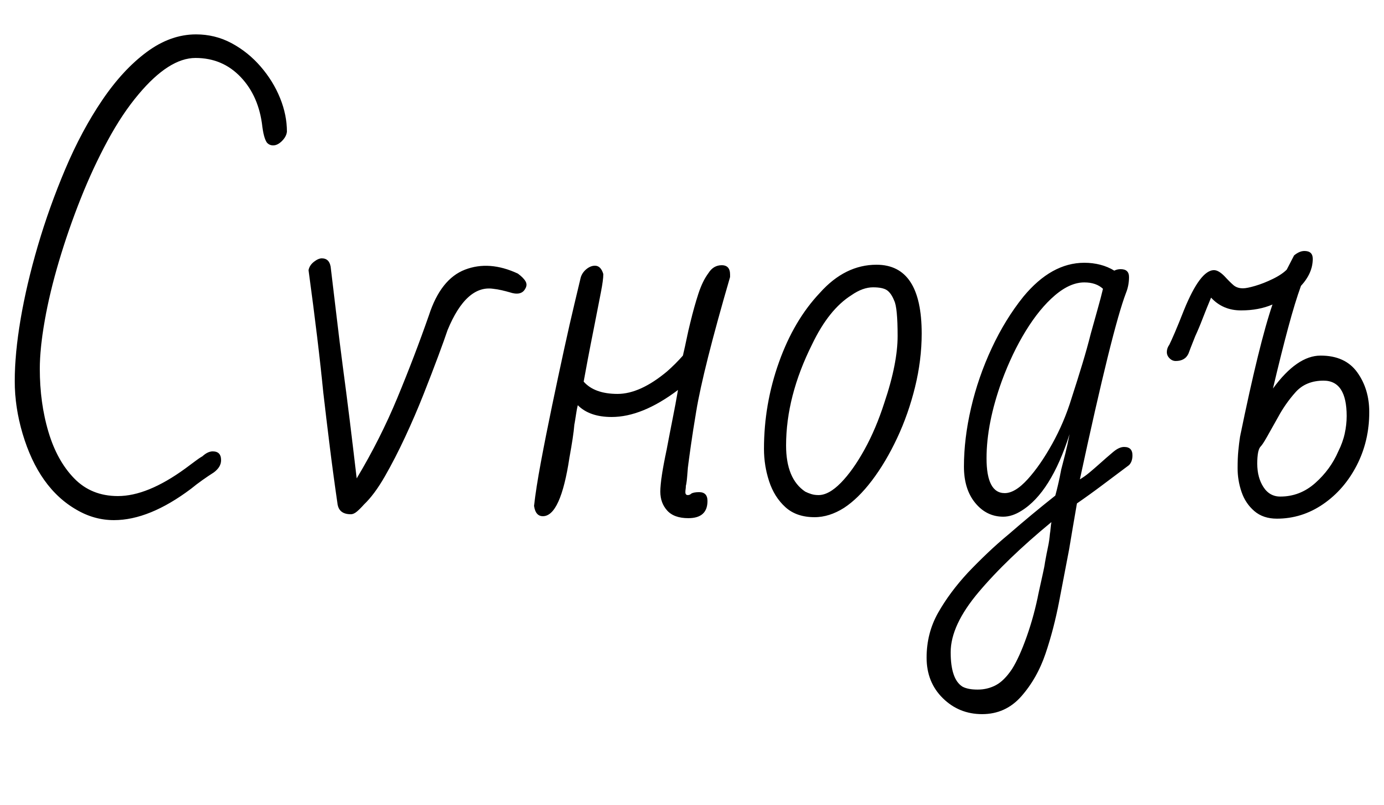
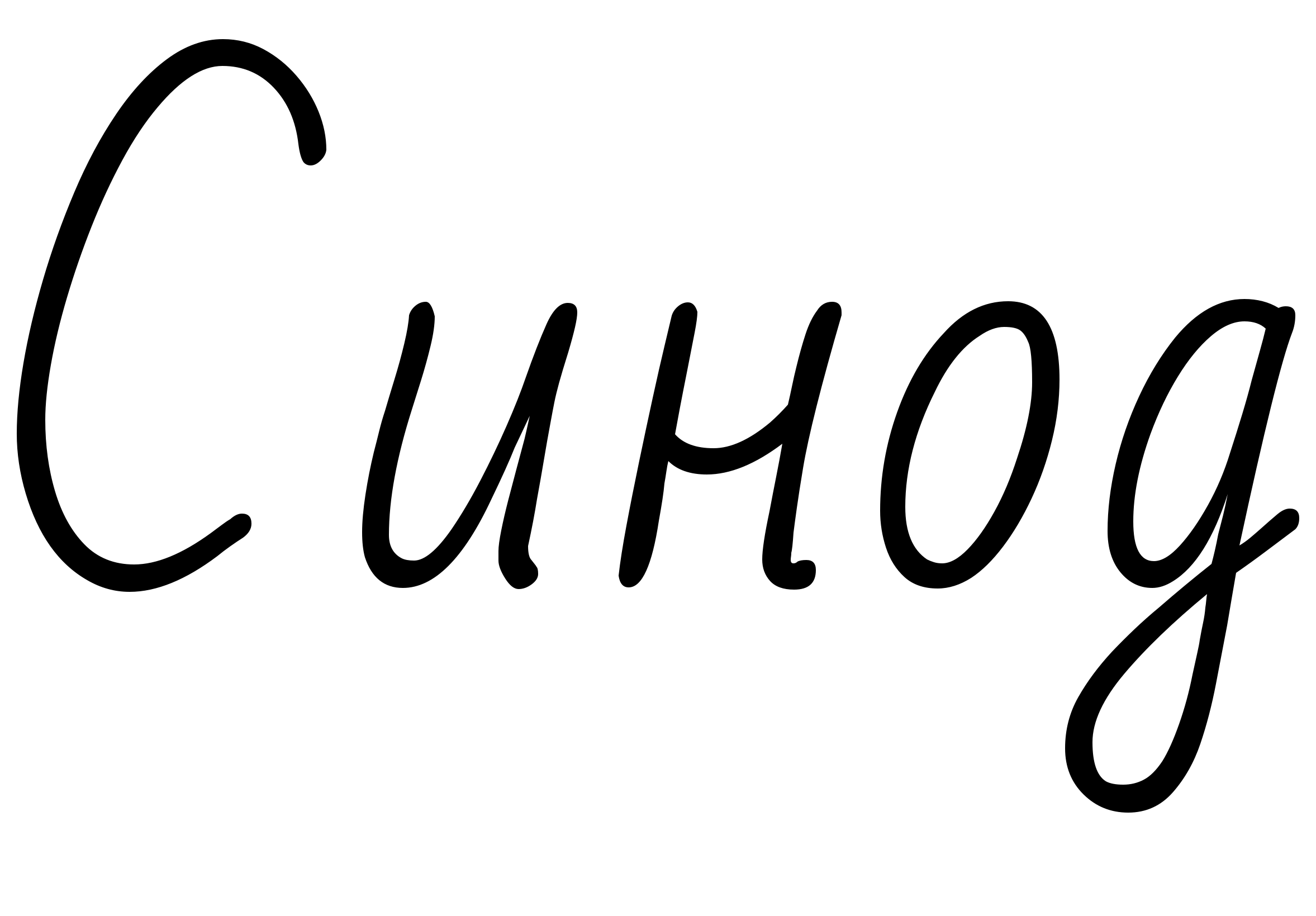
By 1917 izhitsa was nearly gone: only two words in common use still had it, both from the church. [^20]

І і, i-desyaterichnoye
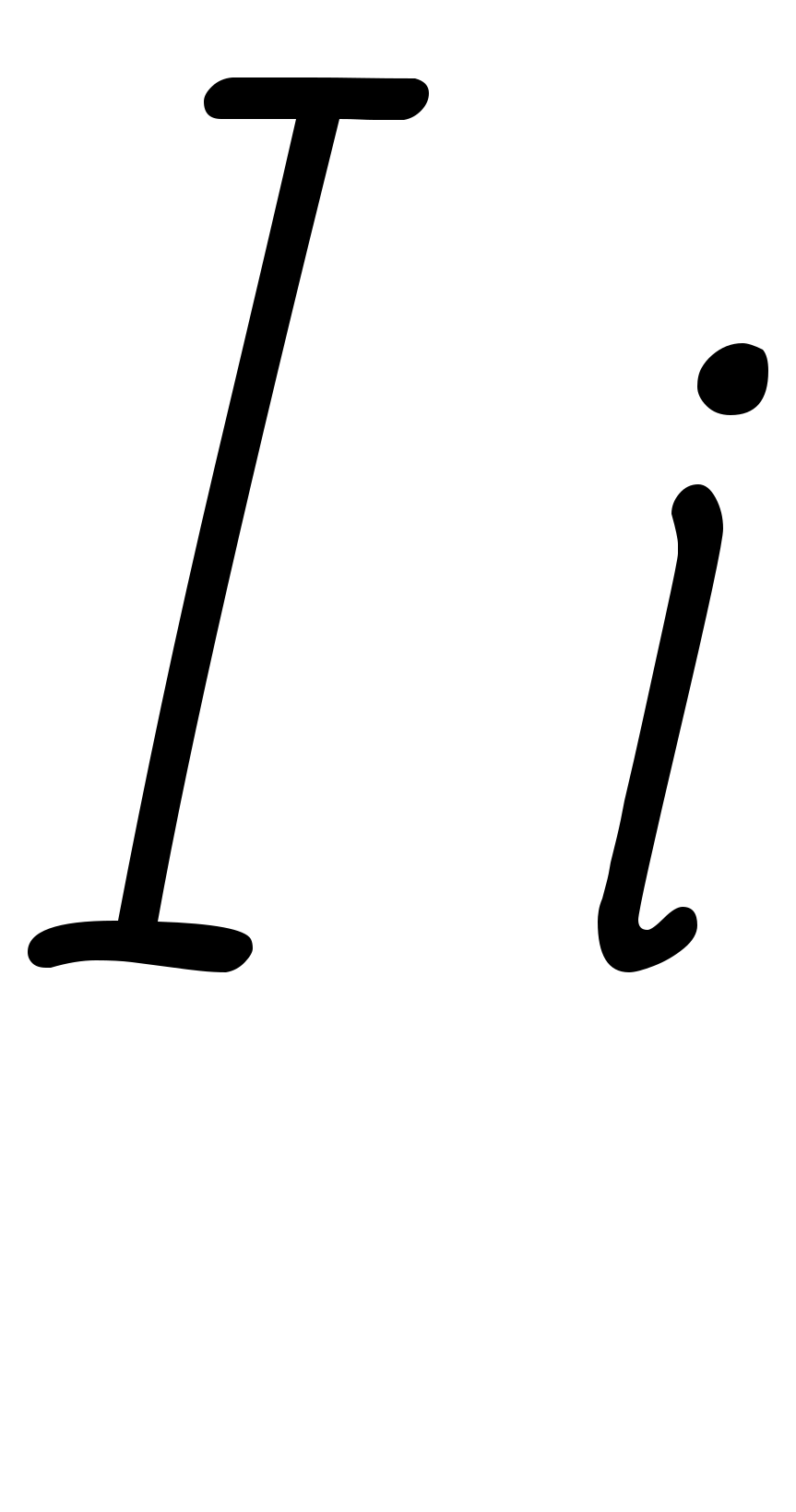
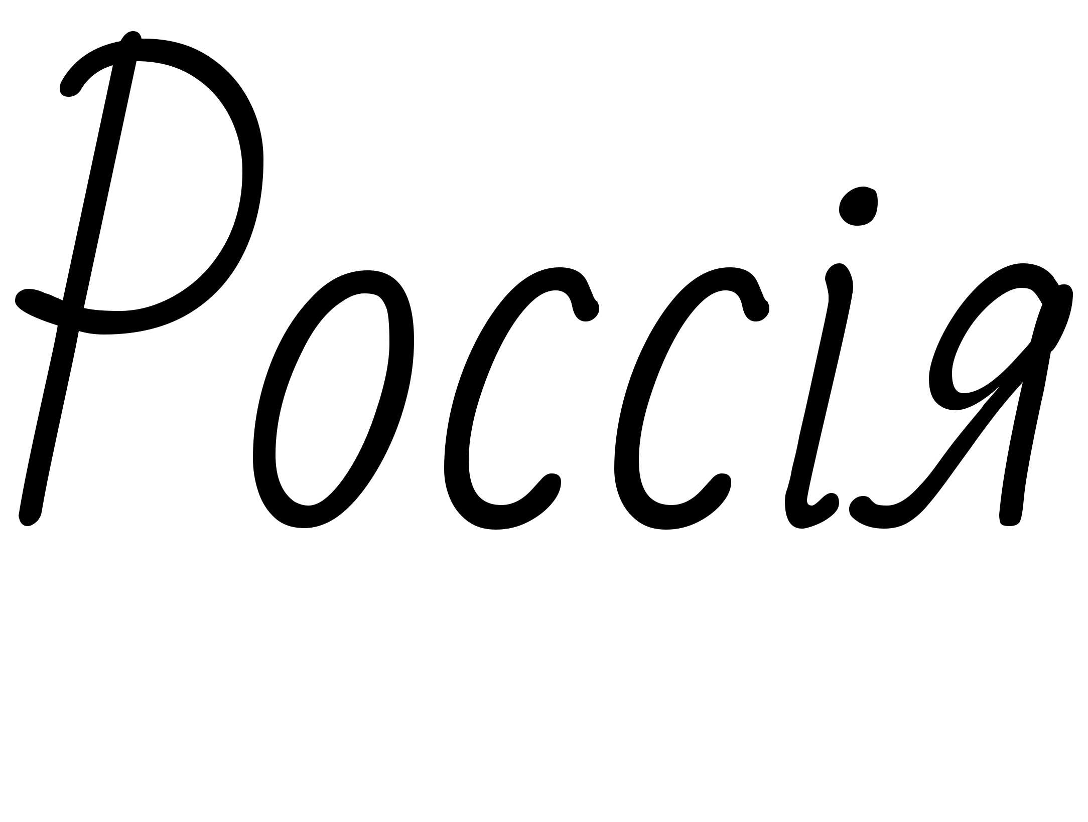
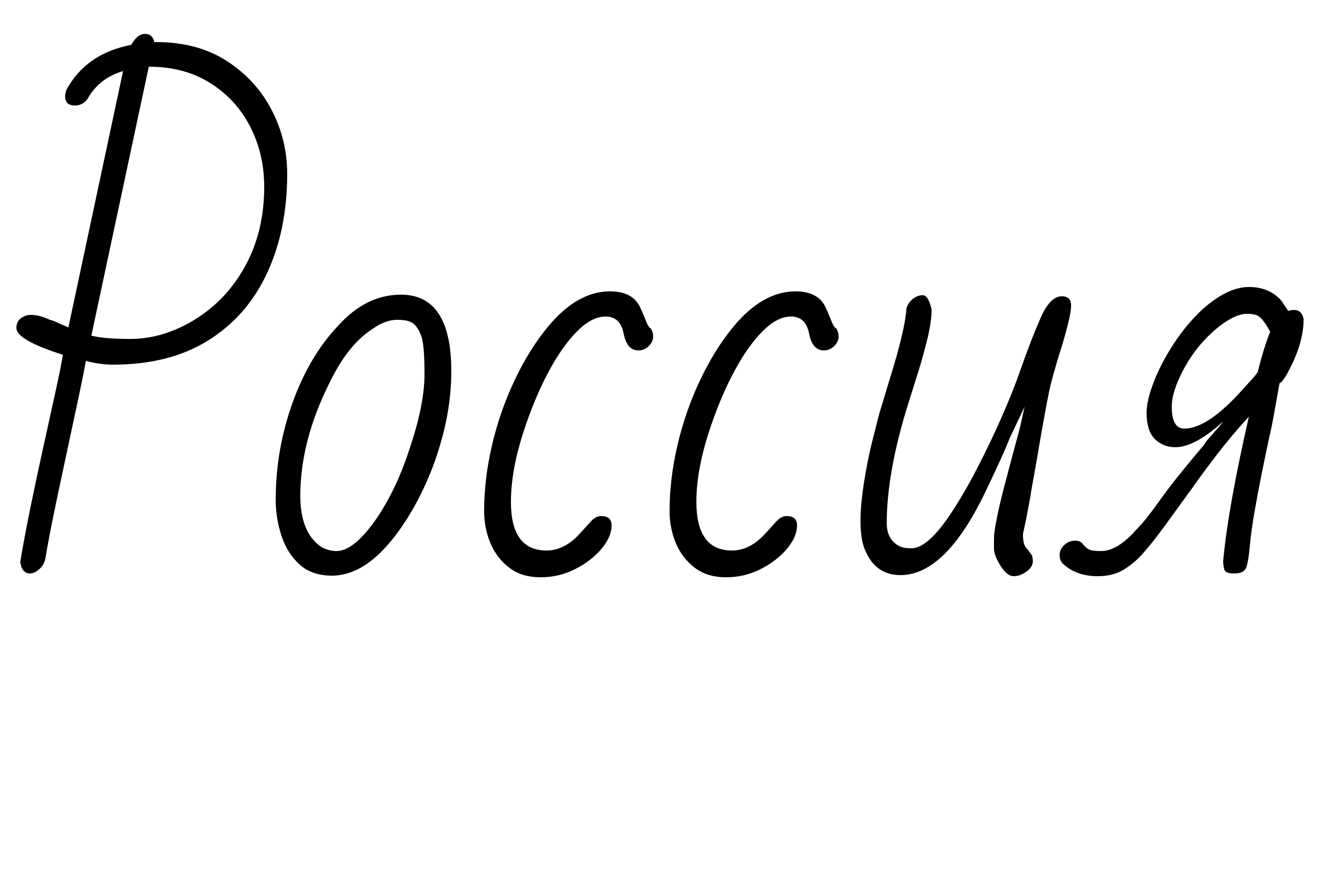
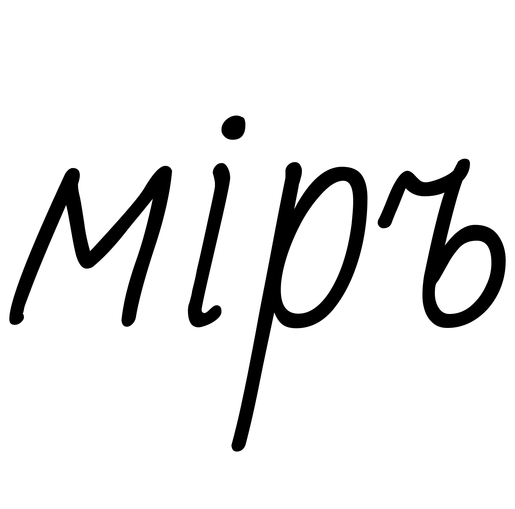
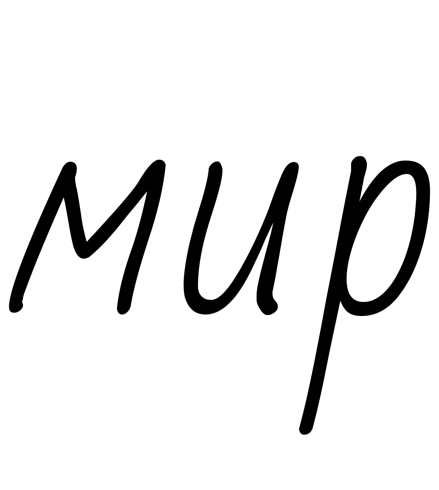
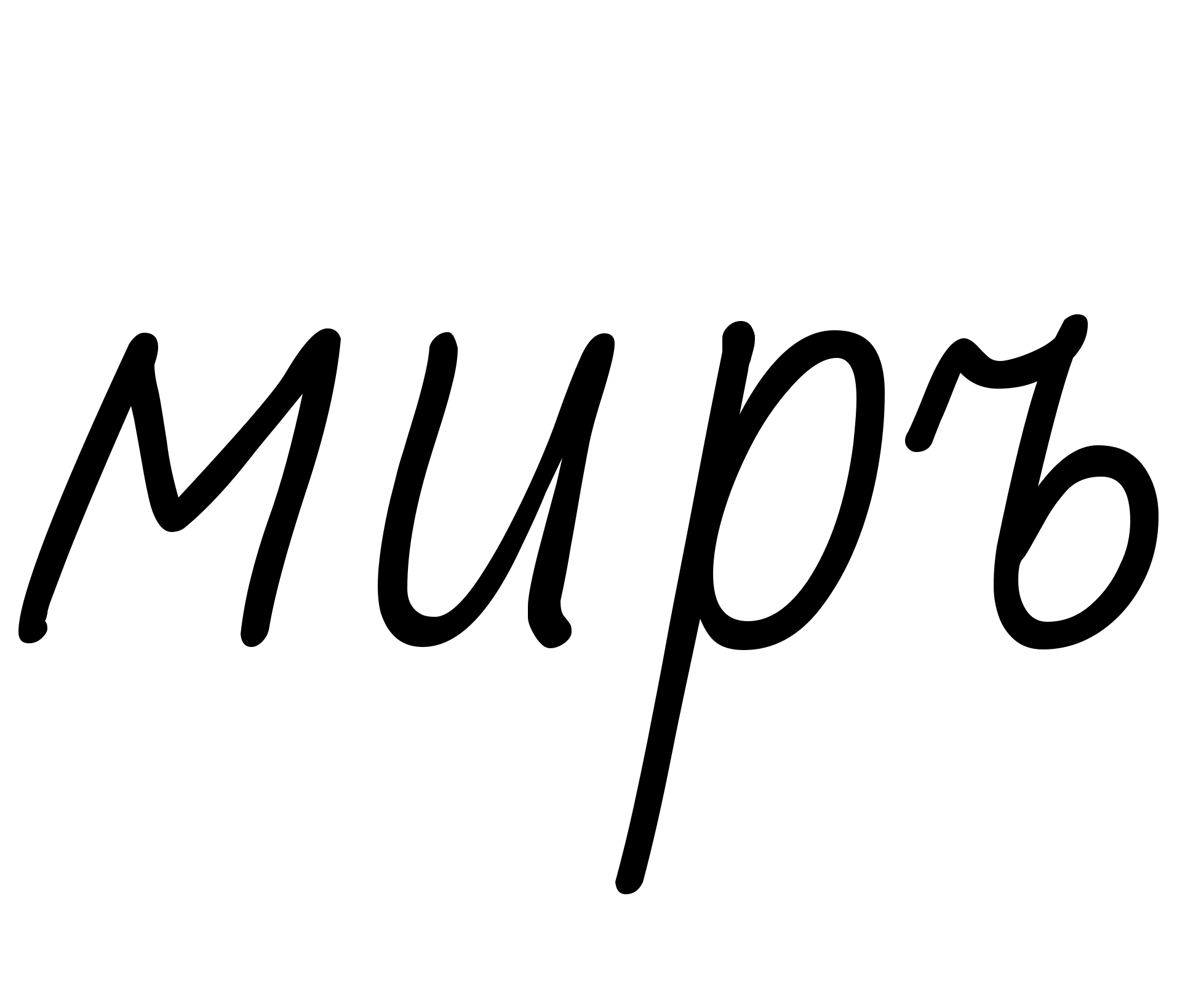
The dotted і stood before a vowel or й, which is why the old spelling of Russia ends in ія. [^21] міръ, the world, and миръ, peace, were two spellings until the reform made both мир. [^16]
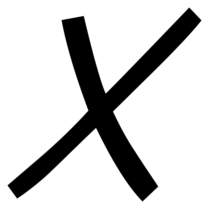
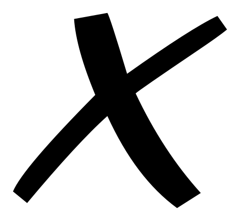
And the silent ъ
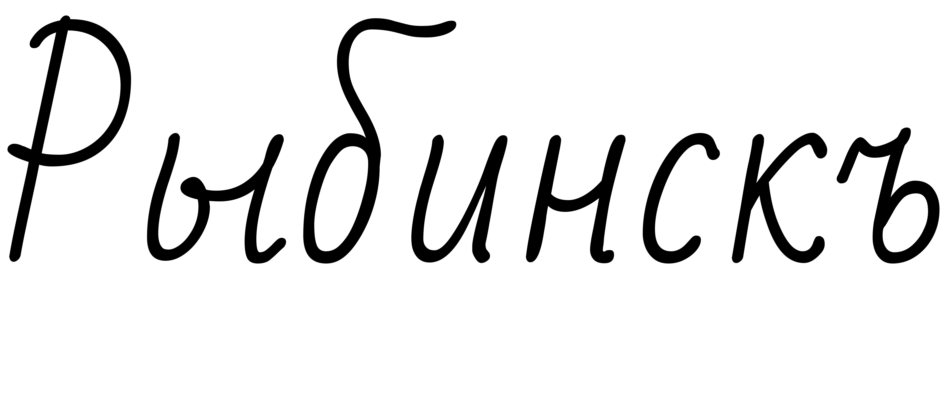
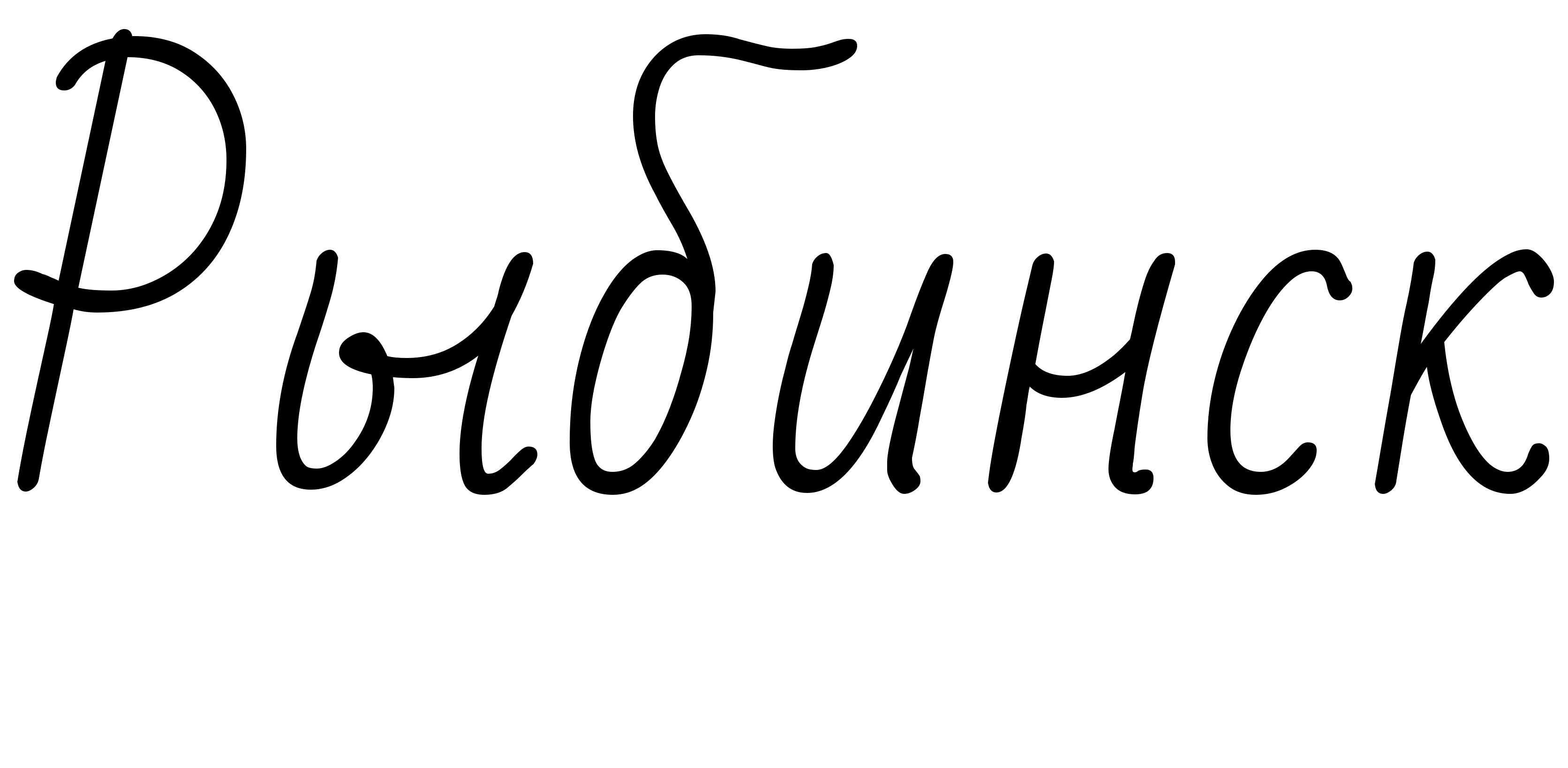
Not a lost letter, but a lost habit: before 1918 a word ending in a consonant took a silent ъ. [^6] [^18]
The before and after spellings are the reform's own examples. [^17]
Every handwritten form on this page is drawn from the outlines of a free, openly licensed cursive typeface: Marck Script (SIL Open Font License 1.1) and Bad Script (SIL Open Font License 1.1). Bad Script draws only the pre-1918 section and the printed-shape т, because Marck Script has no ѣ ѳ ѵ.
How the hand came to be
Before 1708: the running hand
Russian handwriting did not begin with the script taught in schools today. It begins with skoropis — literally "rapid writing" — the running chancery hand that clerks used through the sixteenth and seventeenth centuries for everything a state produces: petitions, land records, court rolls, inventories. It was fast because it had to be, and like every fast hand it paid for speed in legibility. Letters lean, contract, and reach above and below the line. Scribes raised whole letters above the writing line where a modern reader expects none, and abbreviated freely, because the people who would read the document already knew the formulas.
If you are holding something written before the eighteenth century and it looks less like the handwriting on this site than like a hedge, this is why. It is not a worse version of modern Russian cursive. It is a different hand with different habits, and the script that replaced it was built partly to get away from it.
The modern cursive alphabet grew out of that older running script rather than being invented to replace it: it was developed during the 18th century on the base of the earlier Cyrillic tachygraphic writing. [^1] What changed in between was not the pen. It was the type.
1708: Peter's civil script, and the problem it created
In 1708 Peter I introduced the civil script — гражданский шрифт — a type reform for secular printing. [^3] It is the single most consequential thing that ever happened to Russian letterforms, and it happened to printed books first.
What the reform actually did to the alphabet is narrower than it is usually described, and worth stating precisely: Ѧ was replaced with Я, several letters (Ѯ, Ѱ, Ѡ) were effectively eliminated, and all diacritics and accents apart from й were removed from secular usage. [^4] The Church kept its own typography; everything printed for the state and for readers took on the new one.
The handwriting followed. Russian cursive became the handwritten counterpart of so-called "civil" (or Petrine) printed script of books [^2] — which is the fact that explains why the script on this site looks the way it does. It is a hand shaped to match a typeface that was itself shaped to sit beside European printing.
And it is where the trouble starts for anyone reading a Russian document with Latin-alphabet instincts. A hand pulled toward Western letterforms inherits their shapes without their sound values. Lowercase т is written as a Latin *m*. Lowercase д is written as a Latin *g*. Lowercase и is a *u*, and п is an *n*. None of these are coincidences of bad handwriting; they are what the letters are, correctly formed. The letter pages on this site exist mostly to work through the six that catch people out.
1917–18: four letters gone, and a two-second dating trick
The orthographic reform of 1917–18 is the most useful single fact in this whole page, because it gives you a way to date an undated document in about two seconds.
The reform removed four letters by folding each into a letter that sounded the same, conflating the letter ѣ with е, ѳ with ф, and і and ѵ with и. [^5] It also disposed of the silent letter that ended a large fraction of all Russian words: the archaic mute yer became obsolete, including the ъ (the "hard sign") in final position following consonants. [^6]
That second change is the one you can see from across a room. Before the reform, a great many words ended in a letter that was never pronounced. After it, none did. So: find a word-final ъ, or find a single ѣ, and the document is pre-reform. Either one is sufficient; you do not need to read a word of it.
The transition has an edge, and the decree is explicit about where it falls. In December 1917 the People's Commissariat of Education directed that "All state and government institutions and schools without exception should carry out the transition to the new orthography without delay. From 1 January 1918, all government and state publications, both periodical and non-periodical are to be printed in the new style." [^7] Official printing turns over on a date; private handwriting does not. People who learned to write before 1918 went on writing ѣ and the final ъ for years, in letters, in diaries, in emigration for the rest of their lives. So the trick dates the writer's schooling as reliably as it dates the document — which, for a family letter, is often the more interesting fact.
The taught hand: why family letters look alike
The last thing that shaped Russian cursive is not a decree. It is a classroom.
In Russian schools most children are taught from first grade how to write in this script. [^8] A hand taught from a single prescribed model to everyone, at the same age, produces a remarkable uniformity — and that uniformity is the quiet reason a stranger's letter from 1963 is often easier to read than a relative's shopping list. You are not learning one person's handwriting. You are learning a model that millions of people were taught, and then learning how far a particular hand drifts from it.
This is also the practical case for working letter by letter rather than word by word. Once you can identify the taught form of т, и, ш, л, д and р — the six that collapse into each other when a hand is moving — most of a document opens up at once, because the rest of the alphabet carries far less ambiguity.
What a family document adds on top of the taught model is the part no reference can give you: a particular person's slant, spacing and speed, their abbreviations, and the names and places they had no reason to write clearly because they were writing to someone who already knew them.
The dates
Peter I introduces the civil script for secular printing. Ѧ becomes Я, several letters go, and the diacritics go with them.
Modern Russian cursive develops out of the older running hand, skoropis, and becomes the handwritten counterpart of the new printed script.
The People's Commissariat of Education decrees the new orthography, with state publications to follow it from 1 January 1918.
ѣ, ѳ, і and ѵ are folded into е, ф and и, and the word-final hard sign disappears — the two marks that date a document at a glance.
Sources
- [1] Russian cursive — Wikipedia — Russian cursive develops in the 18th century out of skoropis (accessed 2026-09-19)
- [2] Russian cursive — Wikipedia — cursive as the handwritten counterpart of the civil (Petrine) printed script (accessed 2026-09-19)
- [3] Reforms of Russian orthography — Wikipedia — Peter I introduced the civil script in 1708 (accessed 2026-09-19)
- [4] Civil script — Wikipedia — what the 1708 reform actually did to the alphabet: one substitution, several removals, the diacritics (accessed 2026-09-19)
- [5] Reforms of Russian orthography — Wikipedia — which four letters the 1917-18 reform conflated away (accessed 2026-09-19)
- [6] Reforms of Russian orthography — Wikipedia — the word-final hard sign — the other half of the dating trick (accessed 2026-09-19)
- [7] Reforms of Russian orthography — Wikipedia — the decree, its date, and the deadline it set — why documents change over a few months rather than overnight (accessed 2026-09-19)
- [8] Russian cursive — Wikipedia — the taught hand: every Russian schoolchild learns this script from first grade (accessed 2026-09-19)
- [9] Russian cursive — Wikipedia — the script's Russian name, рукописный шрифт, "(Russian) handwritten script" (accessed 2026-09-28)
- [10] Russian cursive — Wikipedia — волшебник and домик: the лш and the ми are written identically (accessed 2026-09-28)
- [11] Russian cursive — Wikipedia — лишишь, "you will deprive", is built almost entirely from one repeated element (accessed 2026-09-28)
- [12] Russian cursive — Wikipedia — different words that are identical in cursive: мщу "I avenge" and лицу (accessed 2026-09-28)
- [13] Russian cursive — Wikipedia — in some hands т and ш take the same shape (accessed 2026-09-28)
- [14] Russian cursive — Wikipedia — the bar written above т, or below ш, to tell them apart (accessed 2026-09-28)
- [15] Russian cursive — Wikipedia — т written in its printed T shape instead of the m shape is common (accessed 2026-09-28)
- [16] Reforms of Russian orthography — Wikipedia — есть/ѣсть (is / to eat) and миръ/міръ (peace / world), told apart only in spelling until 1918 (accessed 2026-09-28)
- [17] Reforms of Russian orthography — Wikipedia — the article's before/after list: дѣти to дети, мараѳонъ to марафон, Россія to Россия, Сѵнодъ to Синод (accessed 2026-09-28)
- [18] Reforms of Russian orthography — Wikipedia — the final hard sign dropped: Рыбинскъ became Рыбинск (accessed 2026-09-28)
- [19] Fita — Wikipedia — fita wrote names and loanwords from or through Greek (accessed 2026-09-28)
- [20] Izhitsa — Wikipedia — by the 20th century izhitsa survived in common use only in мѵро (chrism) and сѵнодъ (synod) (accessed 2026-09-28)
- [21] Dotted I (Cyrillic) — Wikipedia — і was written before vowels and й; и elsewhere, except міръ (accessed 2026-09-28)